Usability Tip: No Dead-Ends, Please
Don't confuse and annoy your users by leading them to dead ends.
One of the best ways to learn what works and what doesn’t work when it comes to UI and usability is to look at as many samples as possible, testing out pages and evaluating how certain elements are being treated.
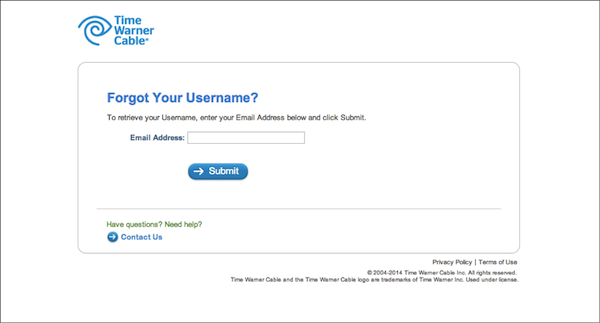
Wanting to pay my cable bill, I tried to sign in to the Time Warner Cable website and realized I'd forgotten my username. I clicked the “Forgot Username?” link and advanced through the username retrieval process. Everything worked great up to the point where I received my username and found myself at a dead end.
Considering that I originally tried to login, it would’ve been nice to see the login screen below my retrieved information and to be allowed to login immediately. Instead, I had to click on the logo to go back to the home page, then the Login link to arrive to the original login screen I started on on. Dead ends create confusion and lead to additional and unnecessary clicks.
1. Time Warner Cable sign-in page
2. Time Warner Cable forgot username page
3. Username retrieval page (dead-end screen)
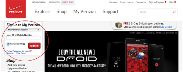
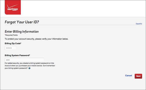
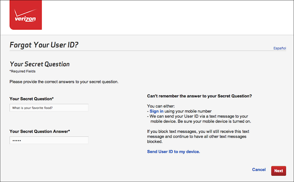
By comparison, Verizon’s user’s ID retrieval process—while four steps long—ends with an option to login, which is intuitive and thoughtful.
1. Verizon.com homepage with sign-in area
2. Step 1 of User ID retrieval process
3. Step 2 of User ID retrieval process
4. Step 3 of User ID retrieval process
5. Final step of User ID retrieval process (with an option to sign-in immediately)


